WEEK 12: SUPERVISOR SESSION (W/ SHANE)
T E S T I N S T A L L A T I O N O R N O T
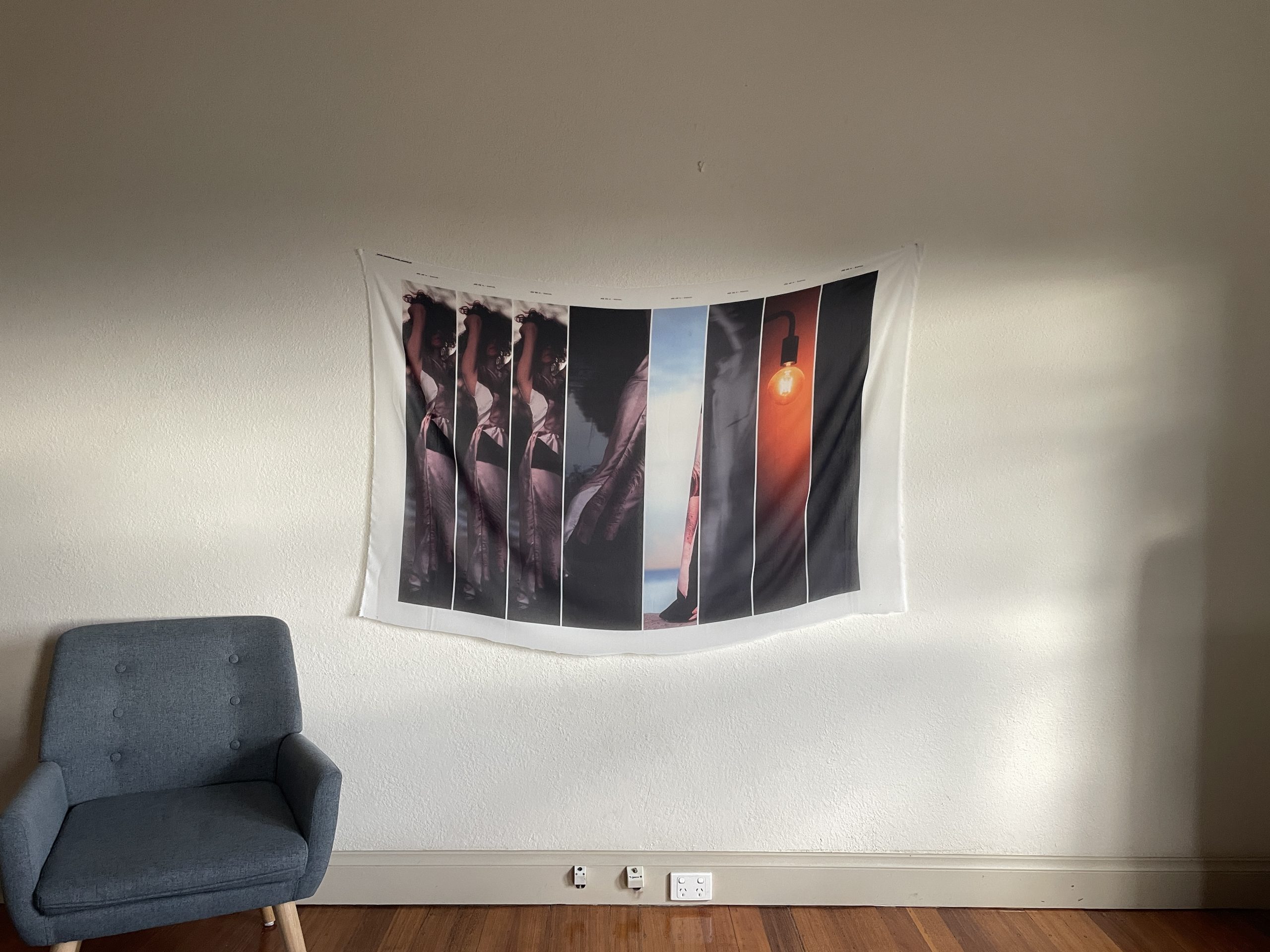
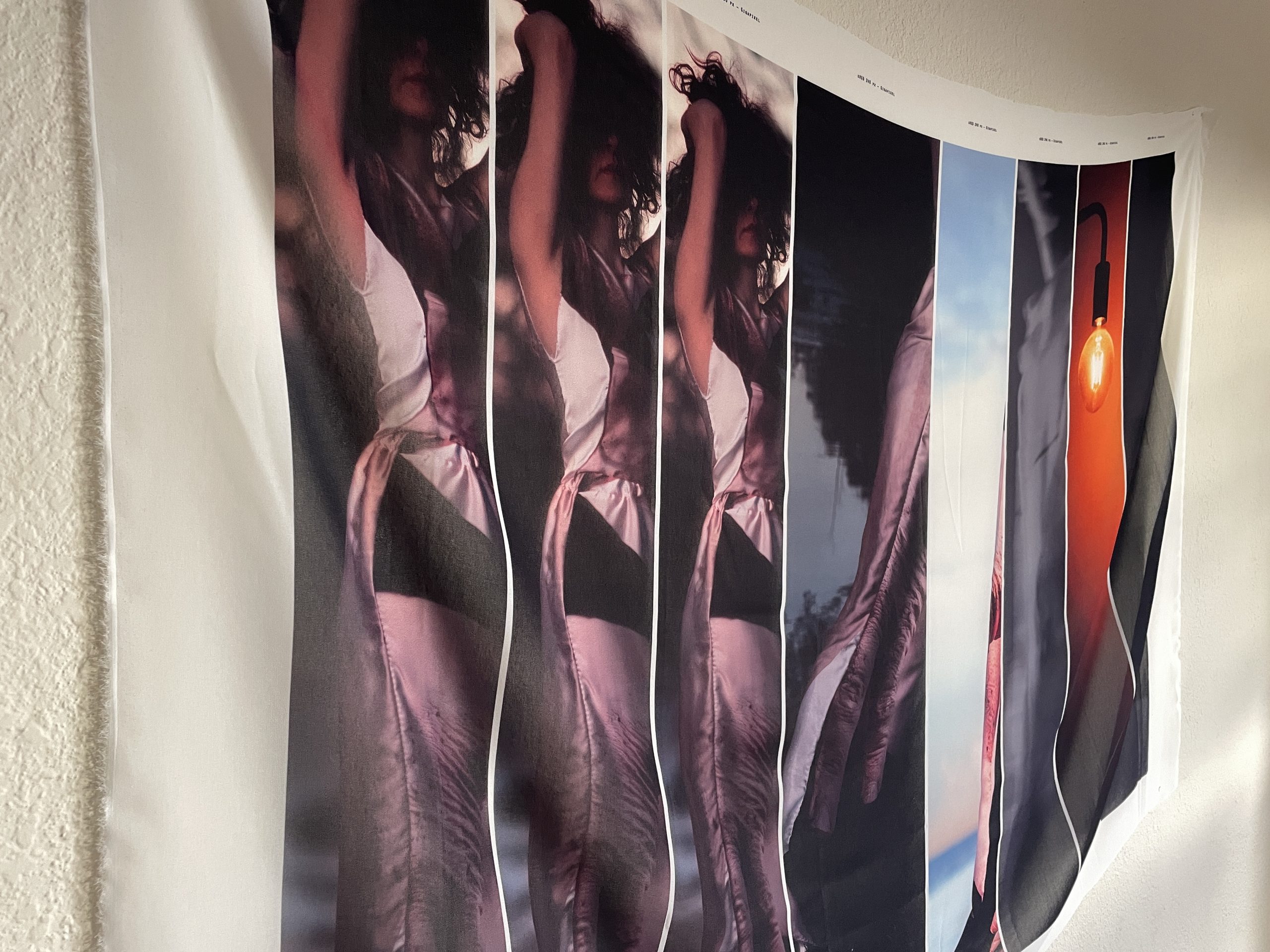
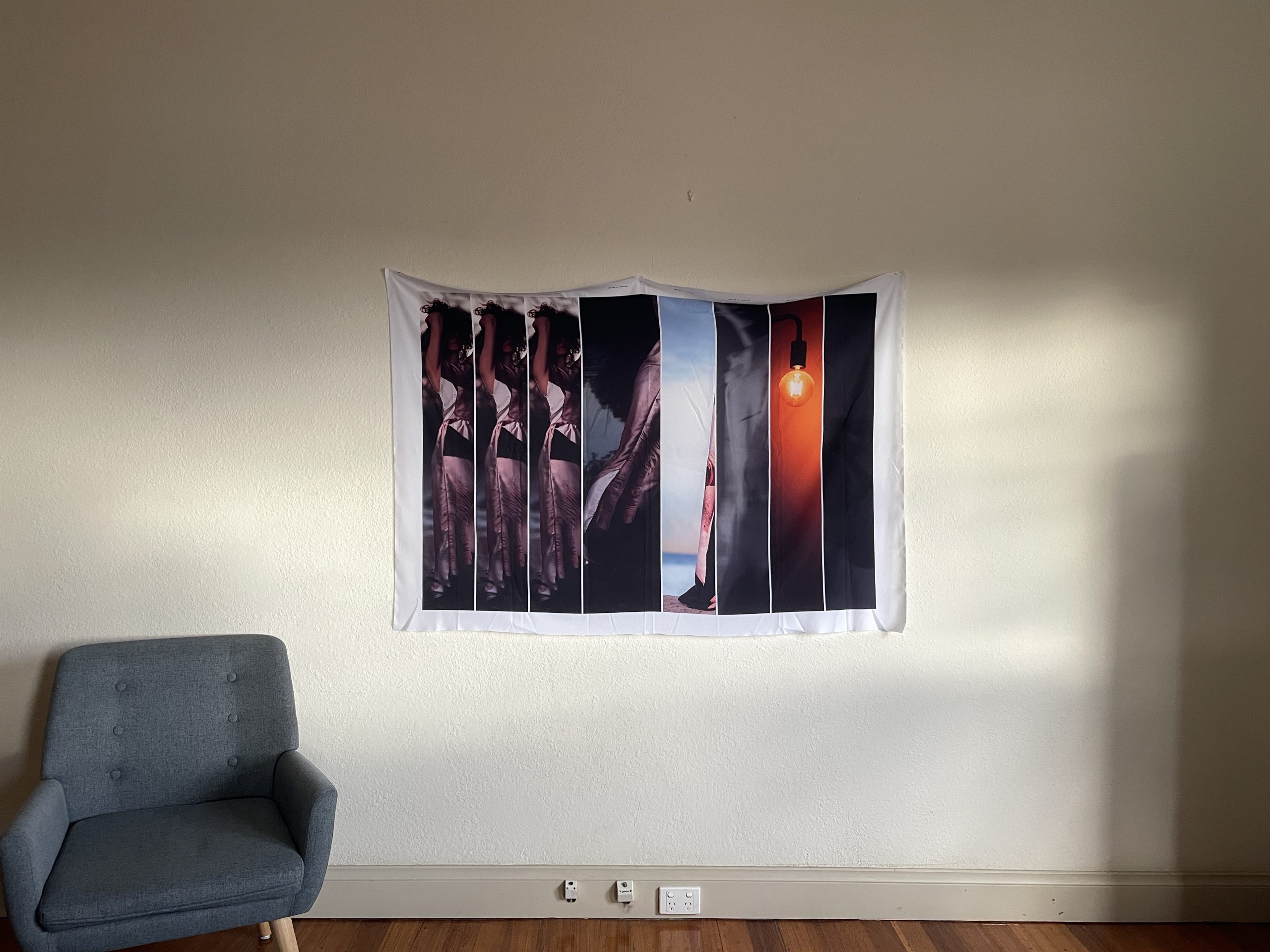
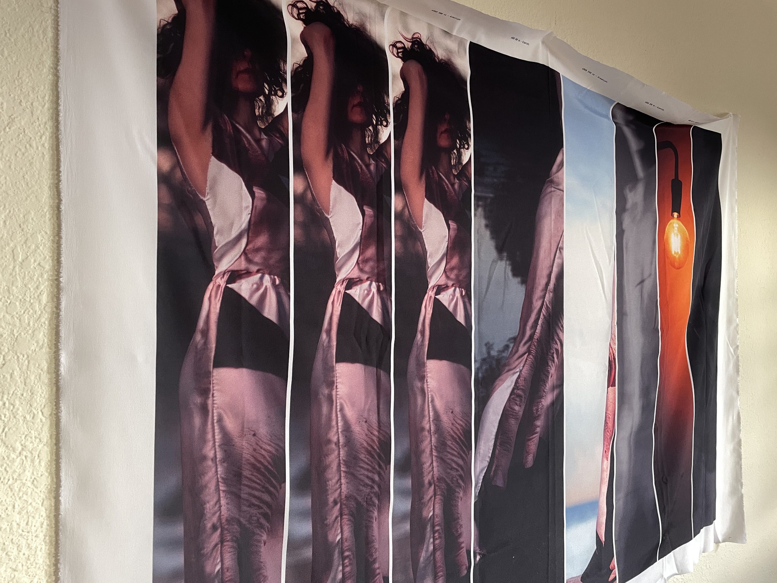
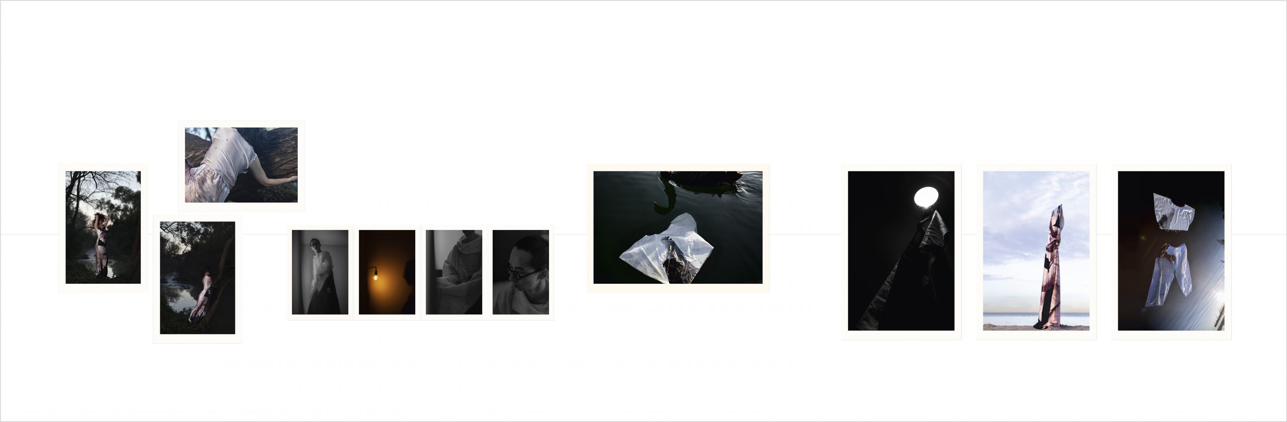
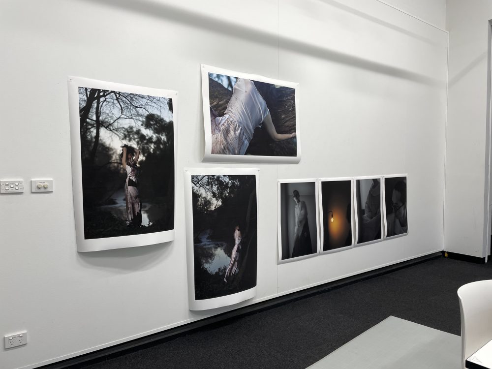
Different drafts. I have a whole wall (1097 cm in length | 360 cm in height).
The horizontal line is at eye height of 160 cm.


Thoughts and questions I originally had for the test installation:
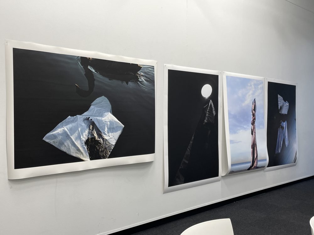
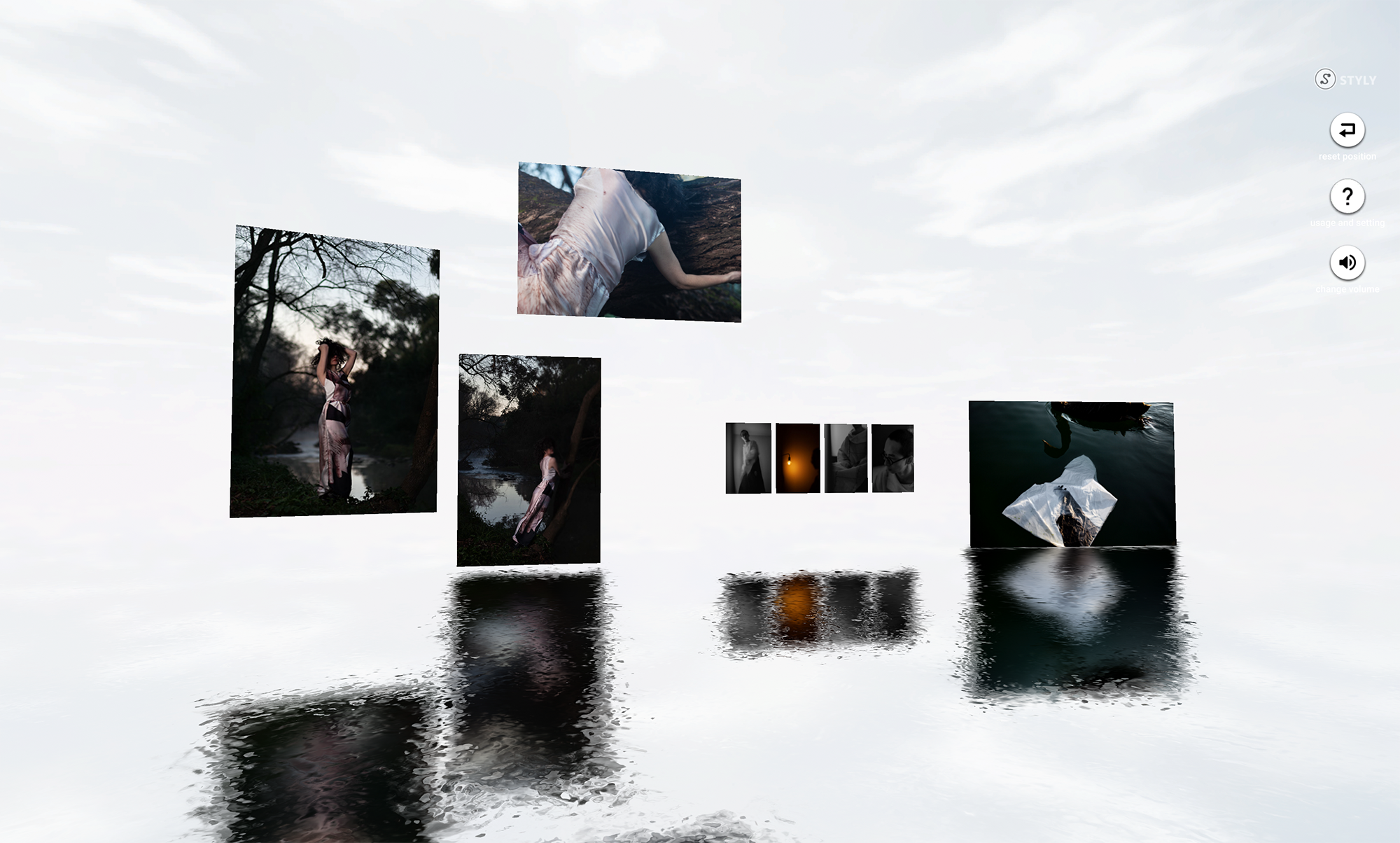
- I'm not sure if I should include the photographs on the right. They are too loud and attract all the attention. They set a different mood and totally distract from the sensitivity of the other images.
- How is the size of the borders?
- How is the size in general?
- Pinning only at the top? I tried pinning on the bottom as well and it made a big bulge (?).
- For the final review: Will only 3 people see the images? I still doubt that it's worth printing all images on rag paper for 3 people to see them. Especially if they get damaged and I – more or less – have to throw them away after.
F E E D B A C K
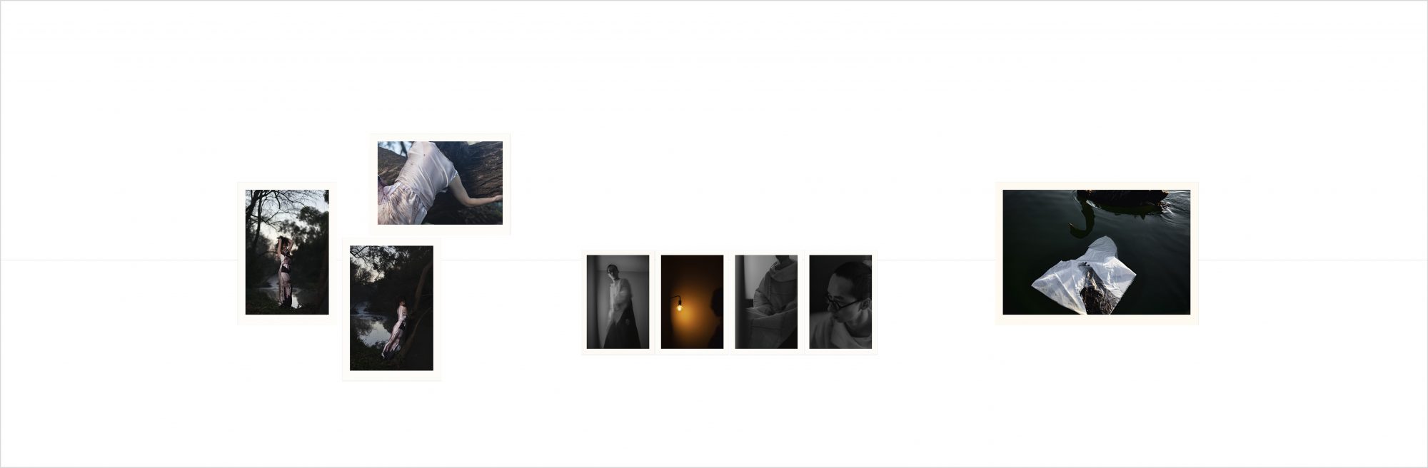
Put the “loud” images first. Then have a (bigger) break. Then show the rest. Then they work as an introduction/primer/appetizer to the work: Shift you from the space you're currently in.
Now, at the end, they are like a full stop. Because they are so powerful, you rush through the initial presentation to get to the final three.
This is an important thought when curating a show: How can you transition someone from where they were (other works or outside world or whatever) into the person you want them to be to look at the work. Sometimes it's about putting in a different kind of image, over-saturating an image, or doing something that brings them closer to an image that they immerse themselves in it. And then they move on to the next work with the right attitude.
It works differently with virtual exhibitions. There you have to find other ways to be loud and to transition people into your (mind) space.
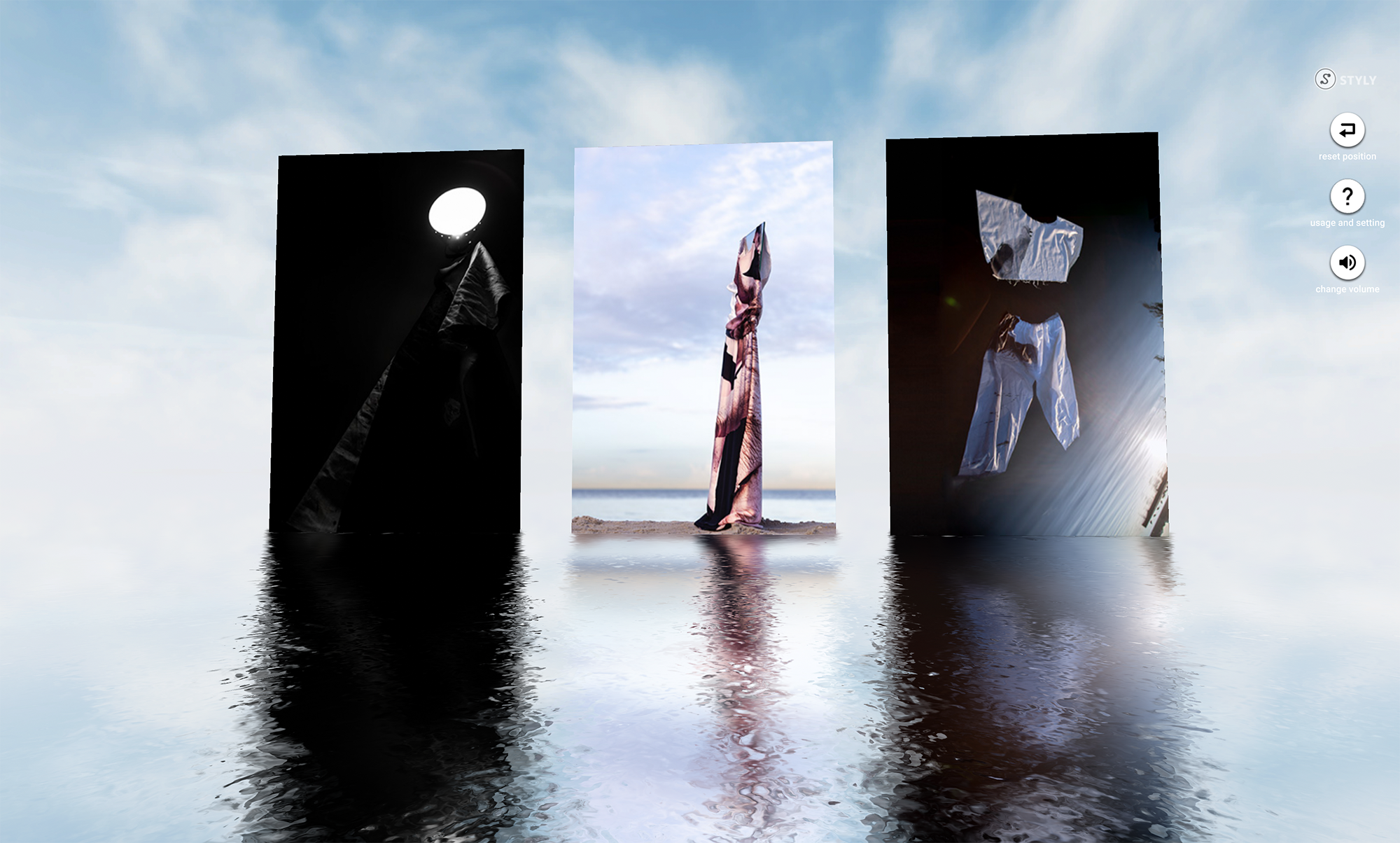
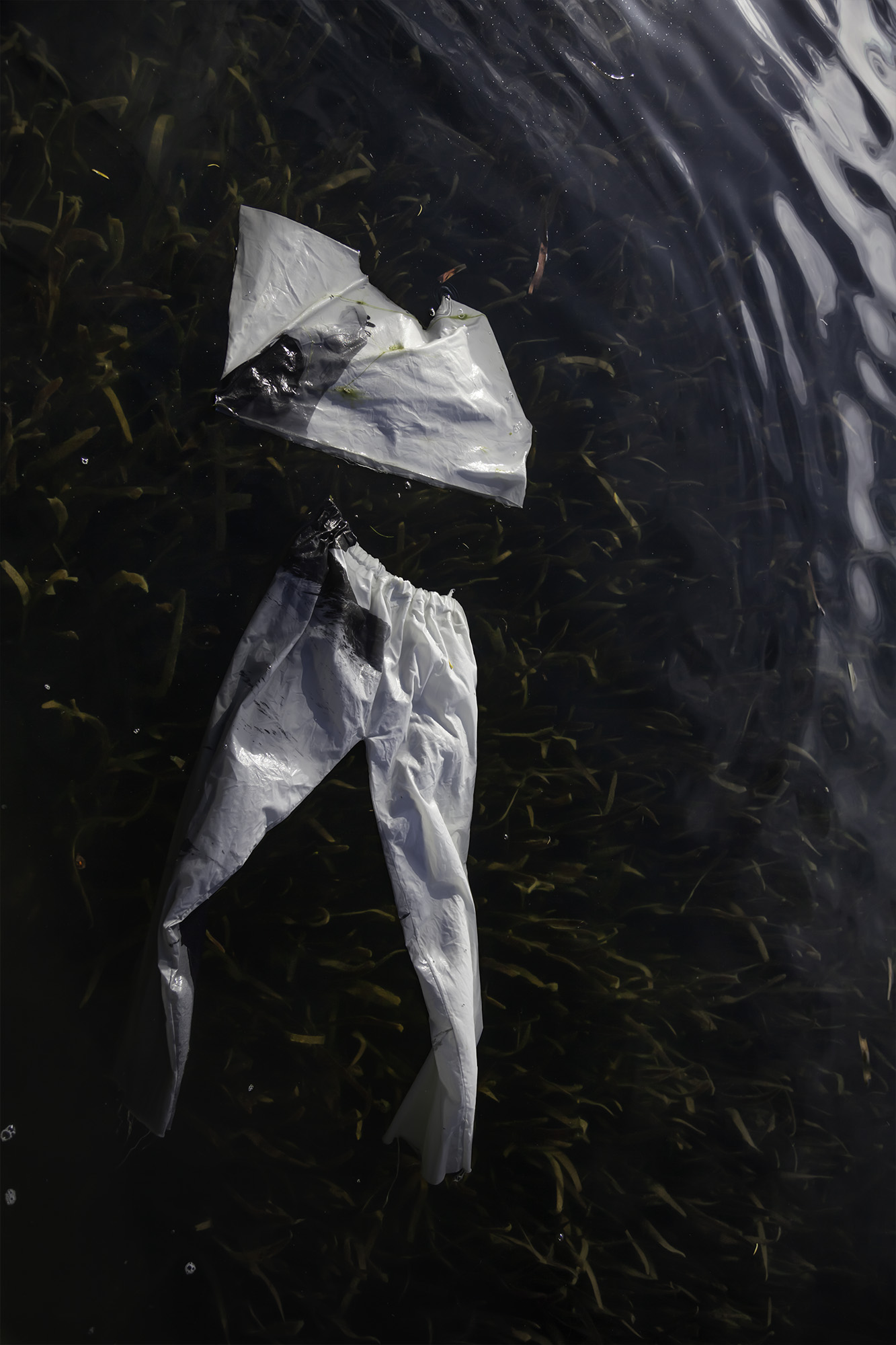
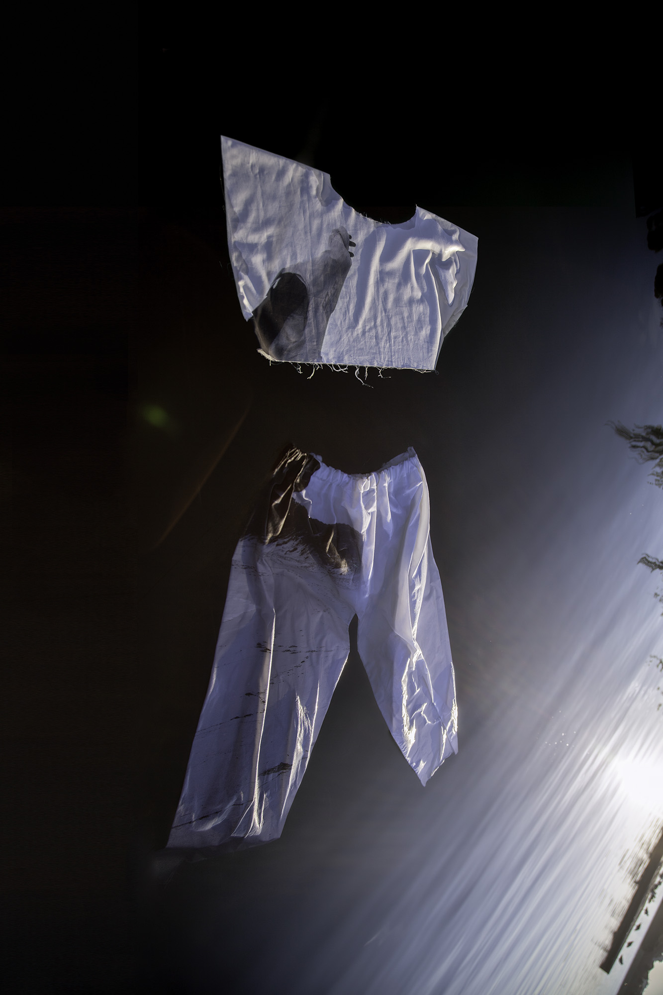
Also, a different order of the three images: First Nikola's clothes, then the mirror, then the lamp. Journey people from being presented with powerful, strong, complex imagery into the more subtle, contemplating space.
Both parts are related. They form part of the same conceptual project around identity and who we are and the notion of the authentic self. But they are different takes on that. They are not a diptych, they are not one cohesive thing.
Having the subtle, contemplating images first might not work for people to get into the right mindset.
Have a bigger distance between them. So that it's clear that they are two separate parts of the work. They are of the same body of work but they are separate chapters within a book.
If you want to show them, you just figure out the best way how to do it. They don't have to work with the other images. They can exist in their own right.
For the final review: Two options.
- Compromise on print quality: Pick one favorite (the one that benefits the most from a fully interrogated fine print presentation) and print the rest on draft paper. “That is the quality I wanted to produce. Rather than compromising on scale and physicality, I compromised on paper stock. But in a professional environment, this is how I'd print.”
- Compromise on scale: Print one image in the intended size on the right paper, then print the rest smaller on the right paper as well.
For the test installation:
Do a test installation and presentation the week after I get out of isolation. And from there we can see if I need more time or if I am on track to submit the final work with everyone else.


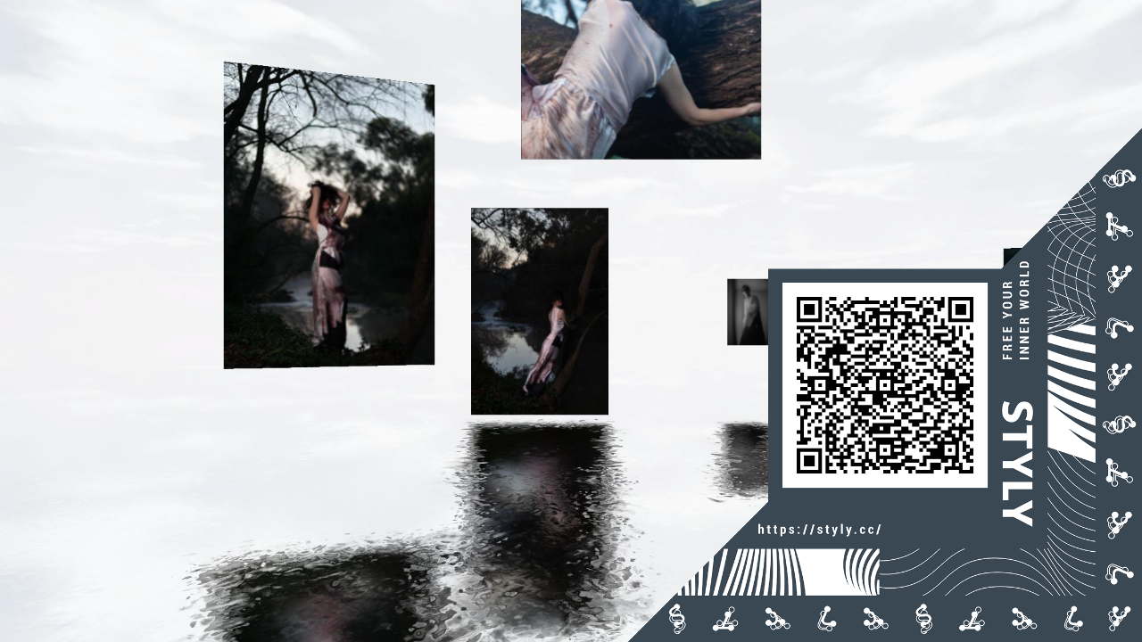
Alternatively, I've tried out Styly:


S T U D I O A N D / O R T H E M E S
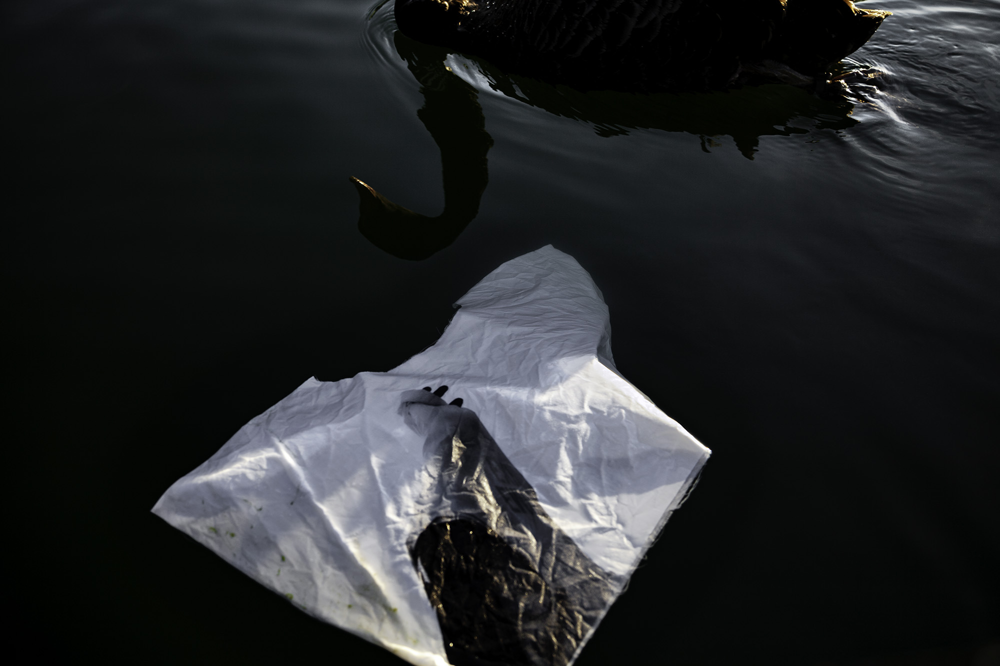
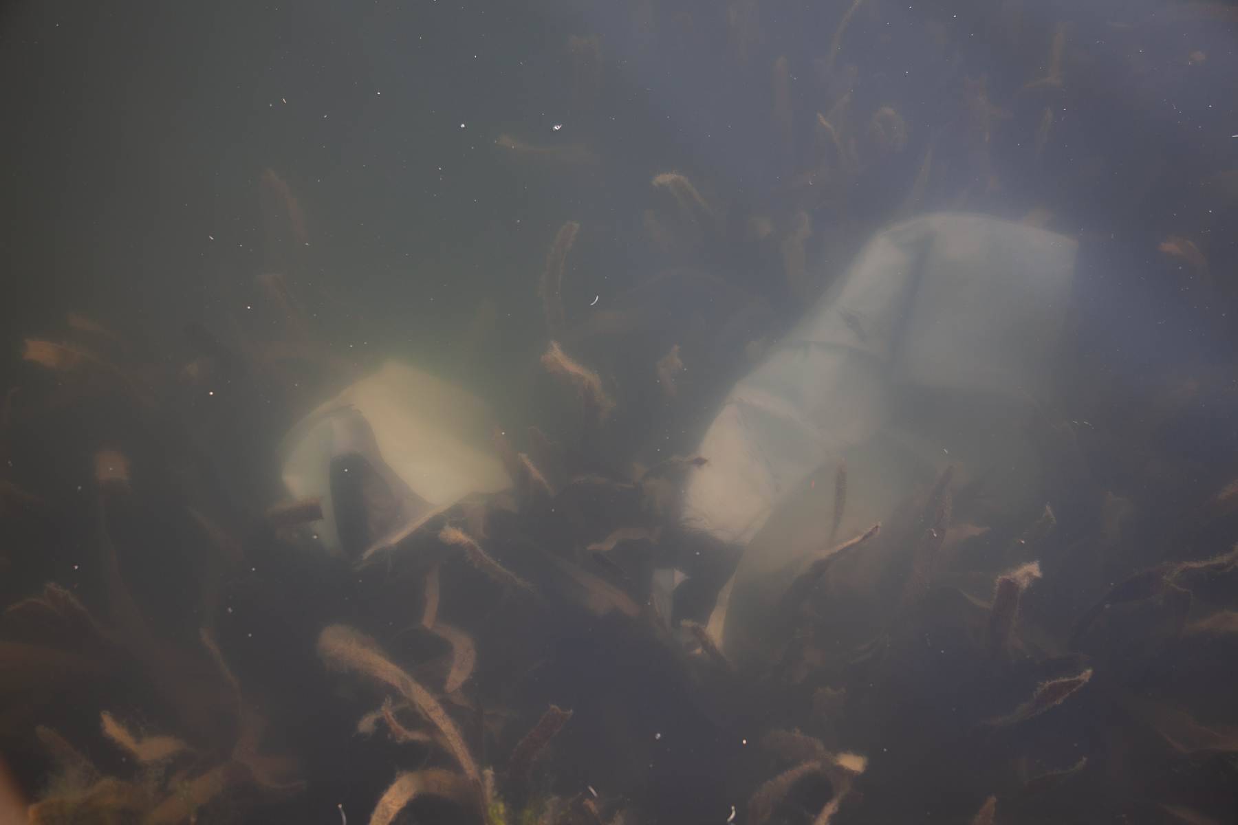
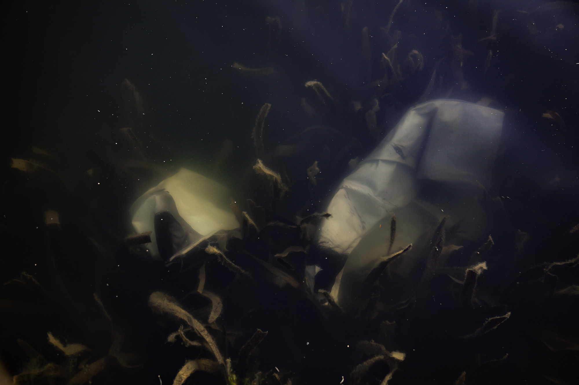
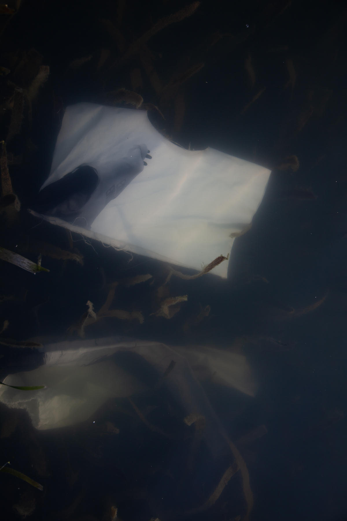
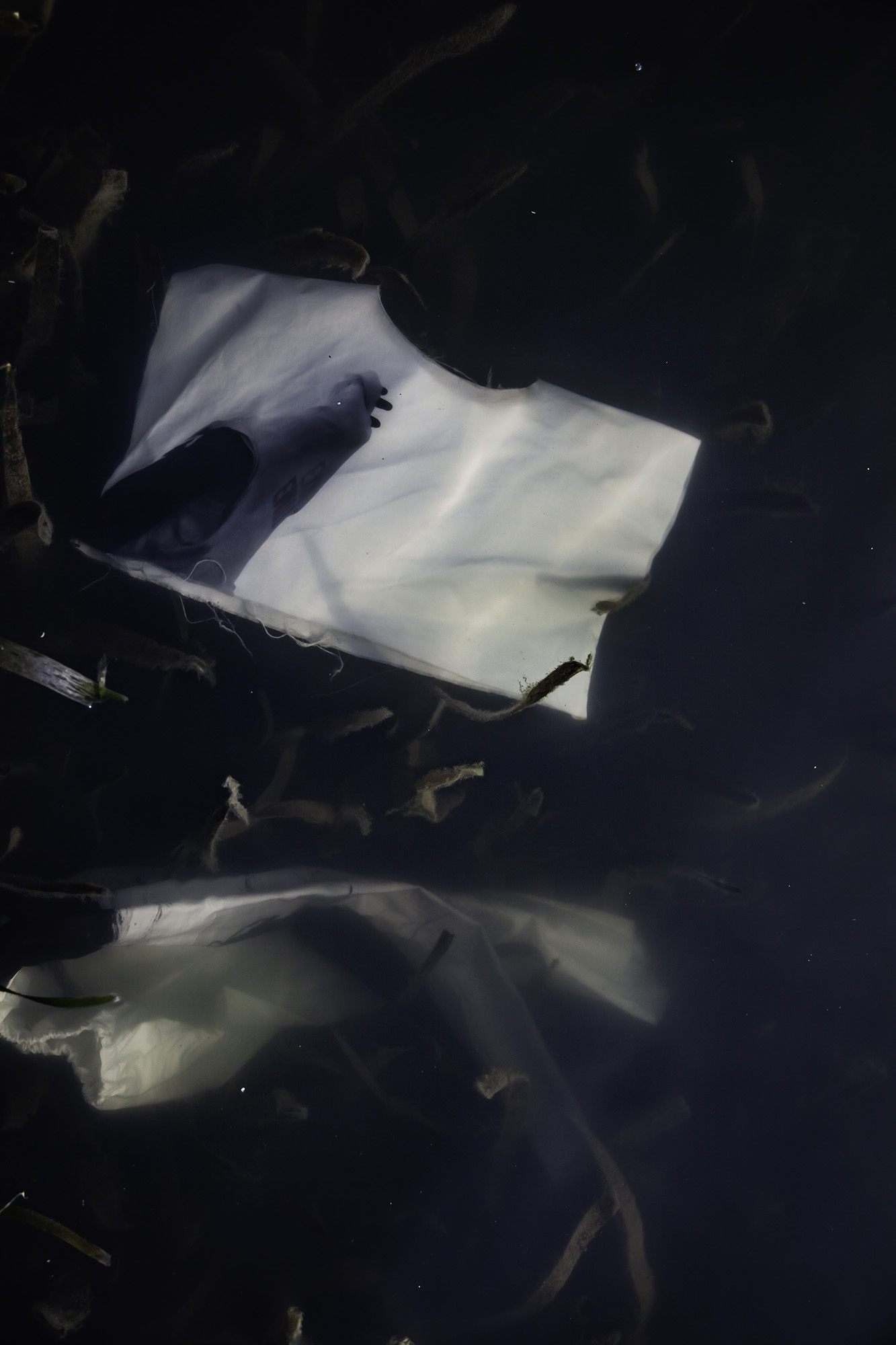
I made more images at the lake. The water wasn't as clear as the time before. I won't be able to re-shoot.


T E S T P R I N T O N F A B R I C
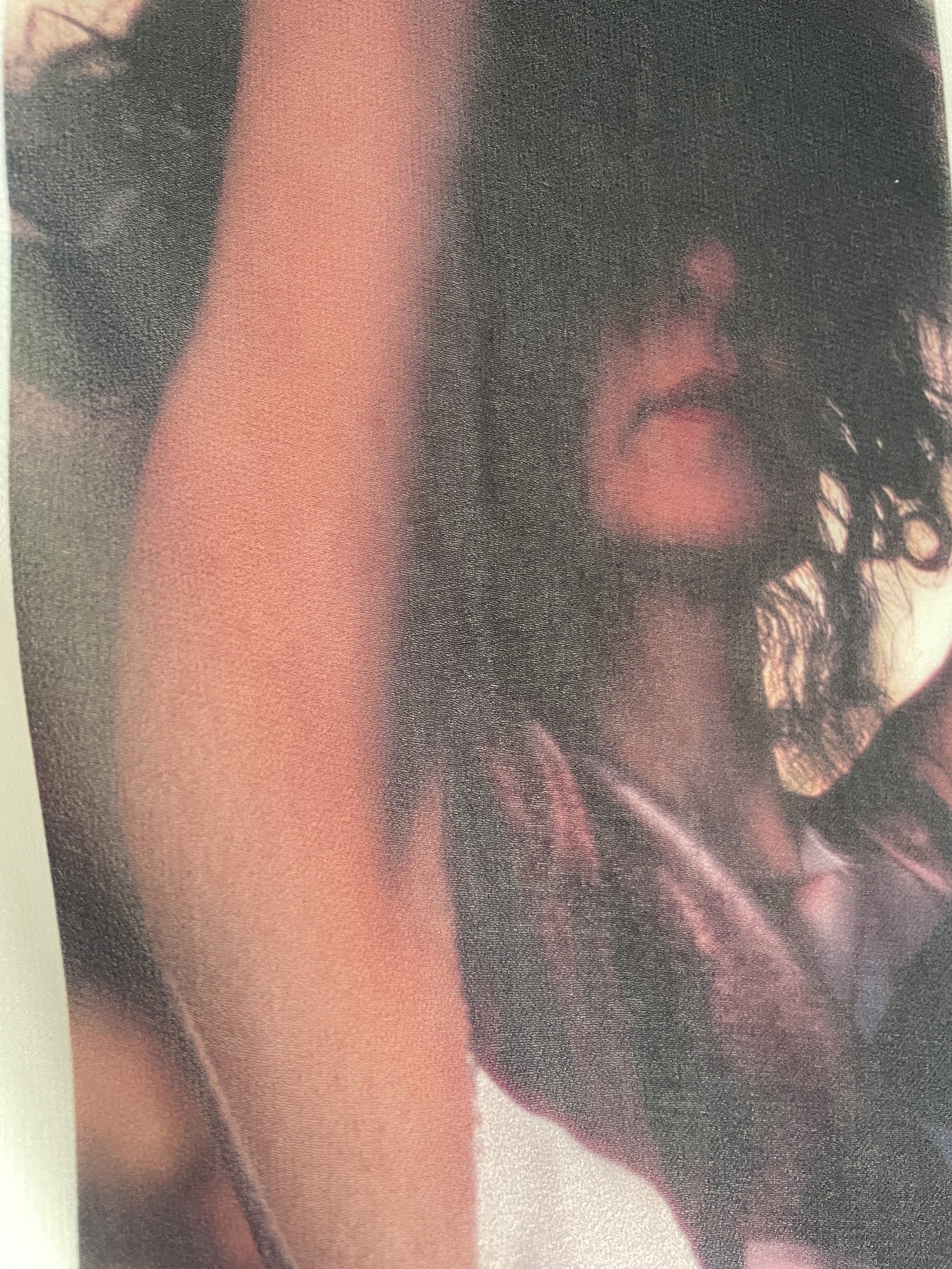
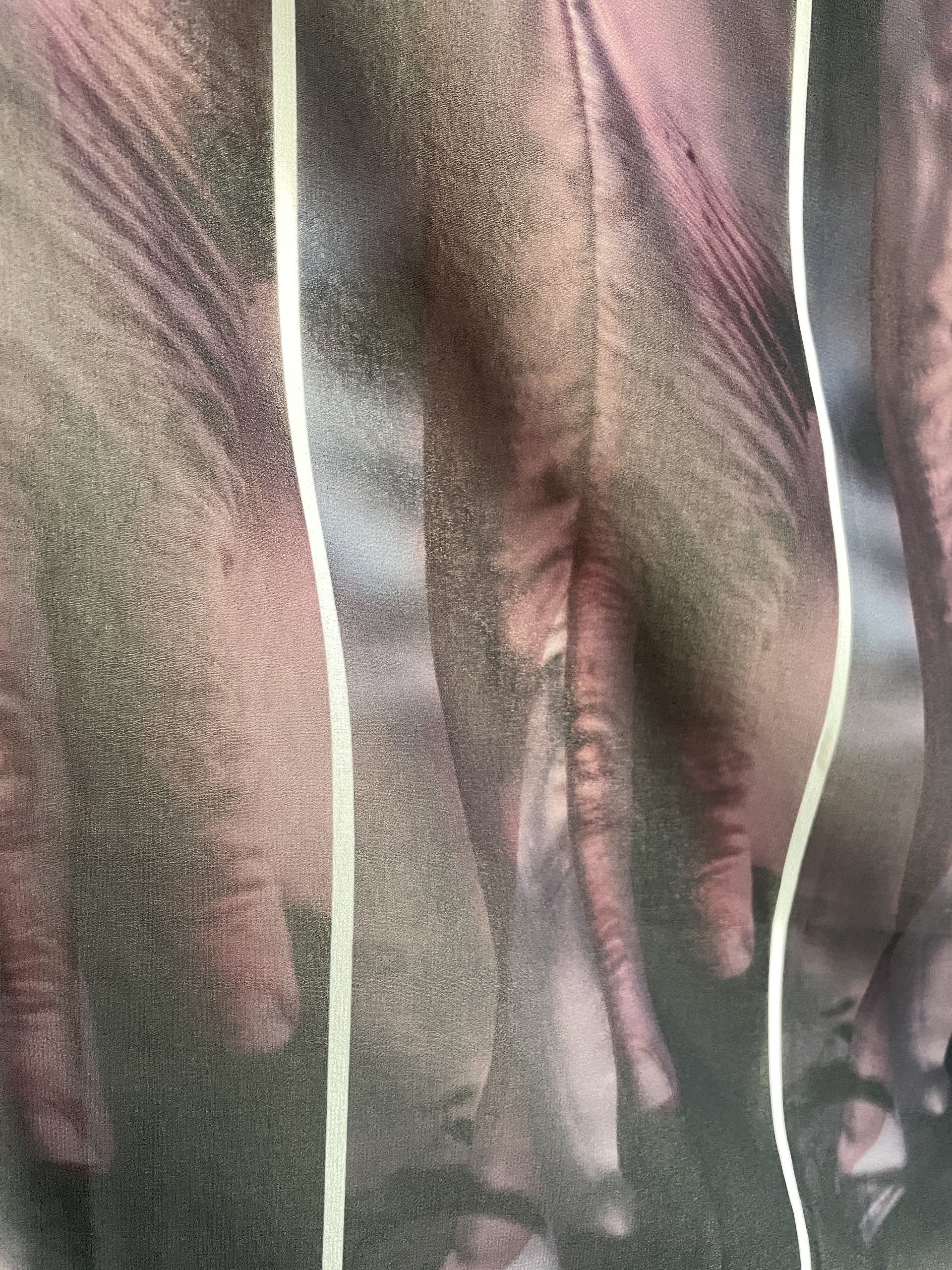
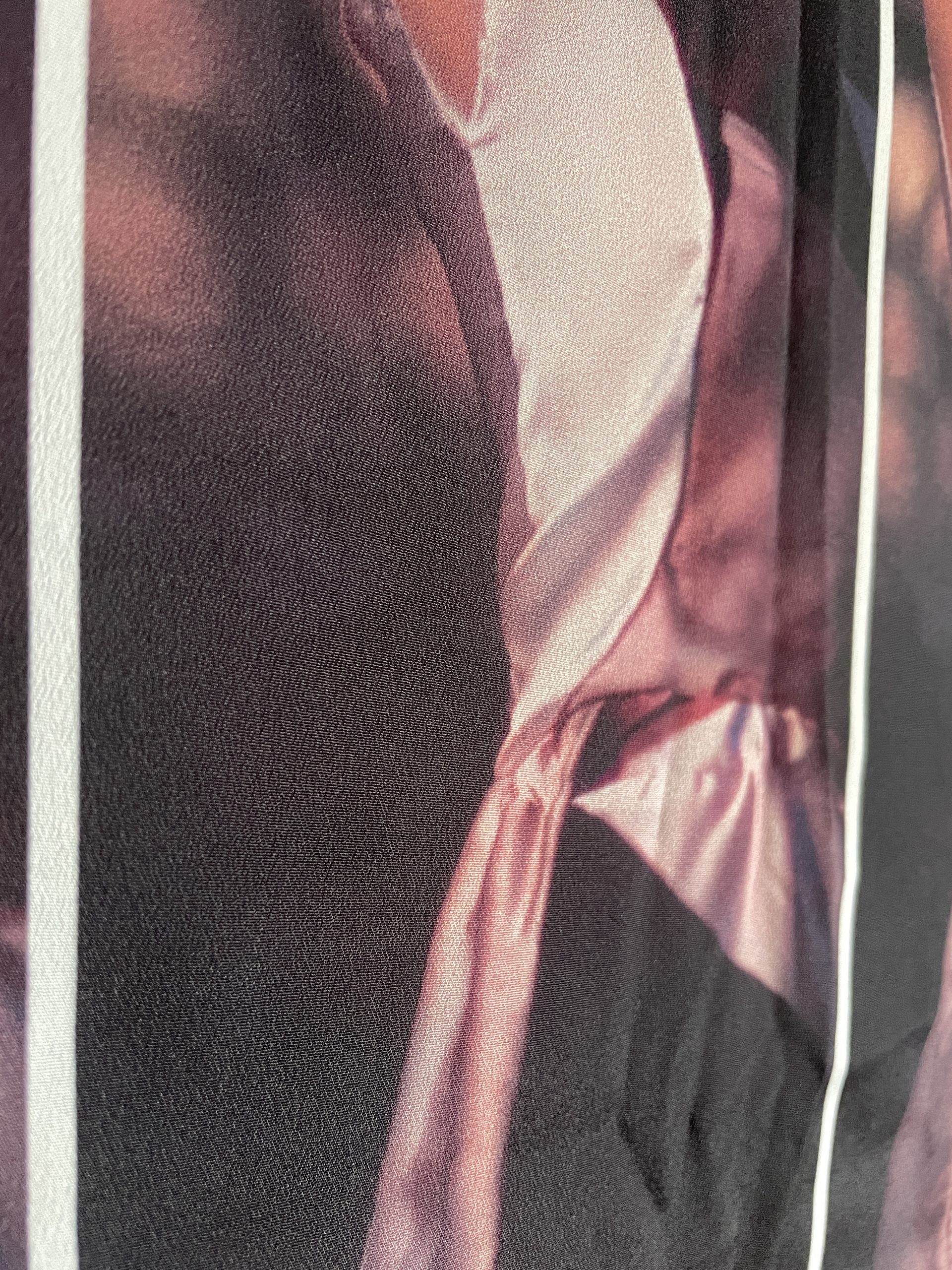
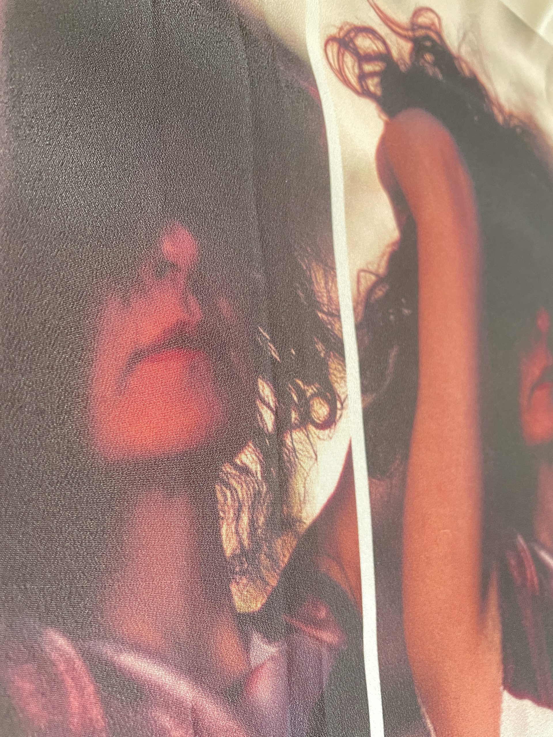
Ages ago I sent sample files to have printed on fabric. Finally, they came back. I like the material but the colors are totally off. I don't think it's realistic to have them printed in the right colors on time.