WEEK 6.2: PROGRESS
Photographs
· Selection from about 1200 pictures down to 50.
· Editing them, starting at the strongest.
· 38 remaining, some in color and b/w.
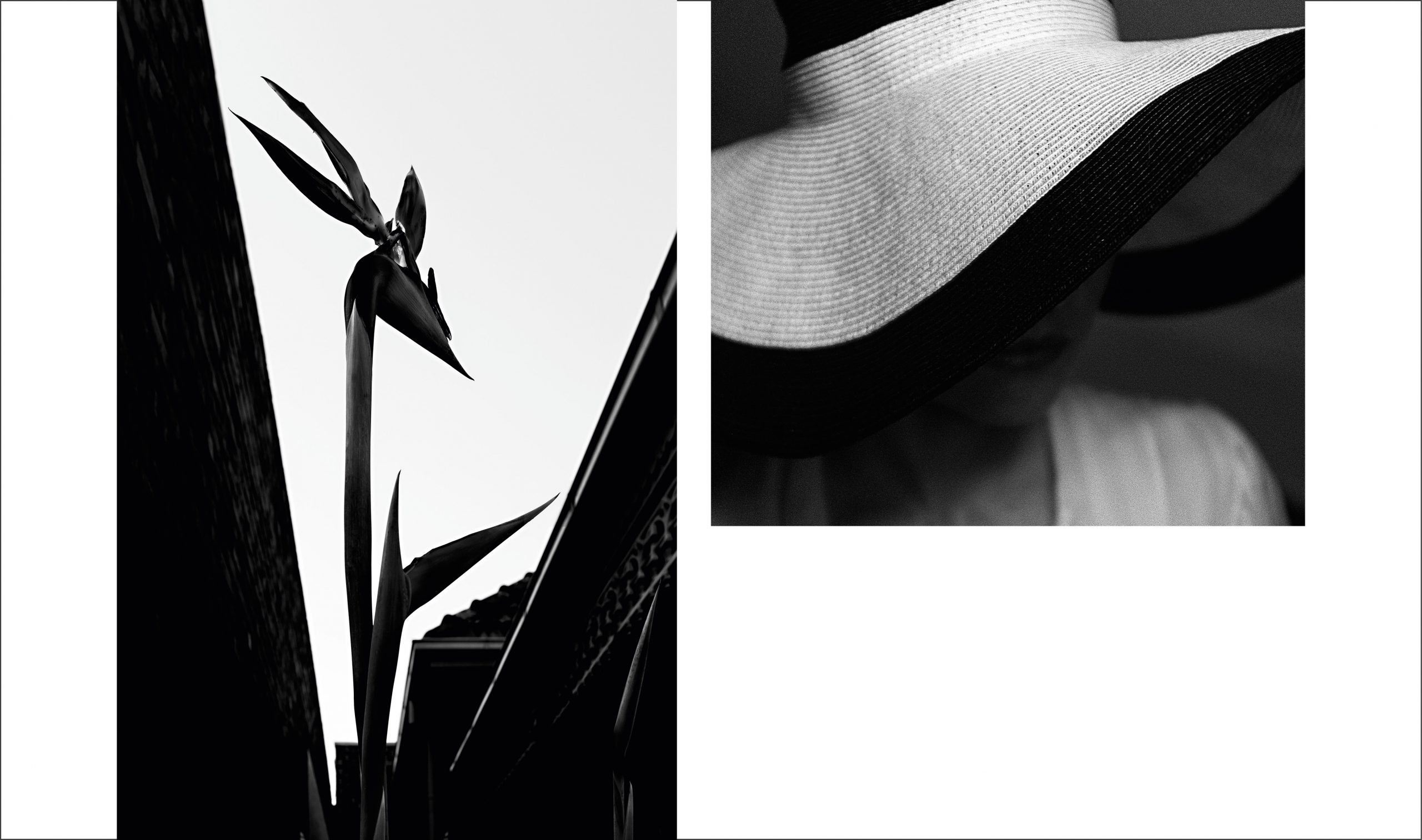
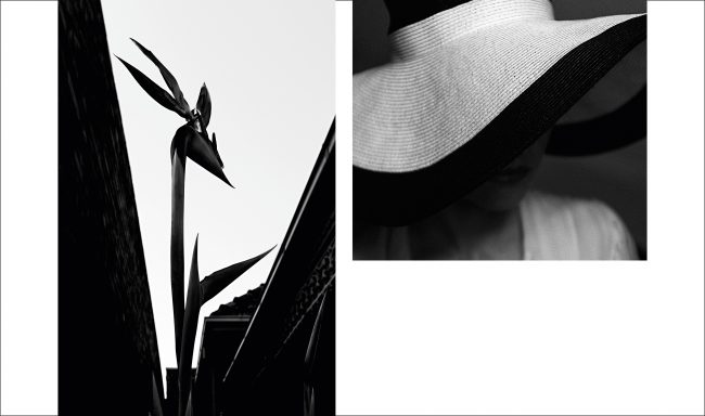
· Sequencing them reduces the amount to 18 and makes clear which work in color and which in b/w.
· The layout is strict and simple, not too playful, yet not too conservative.
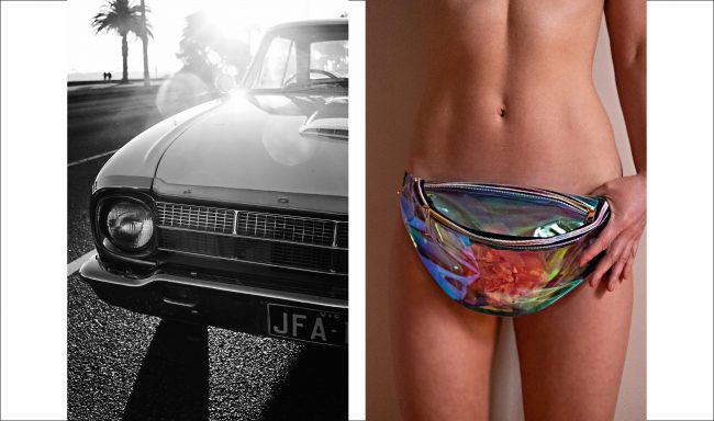
· Once decided which pictures stand for themselves and which are paired, I mix up the order. Having a back and forth between moody, fun and “breaking free”.
· If it didn’t take weeks, I’d have it be printed at Out of the Phone.


Title

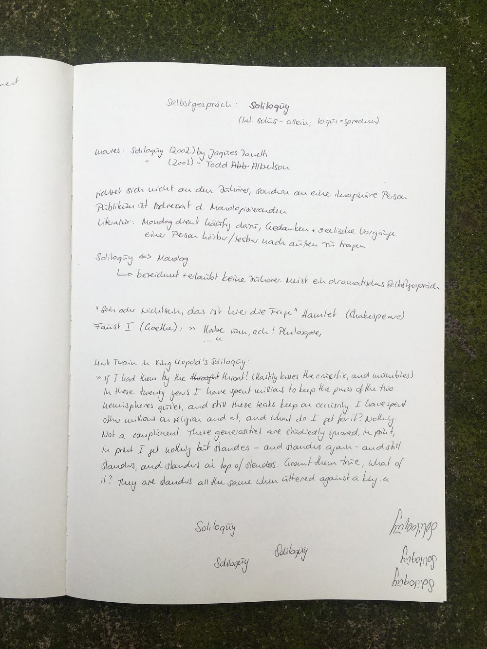
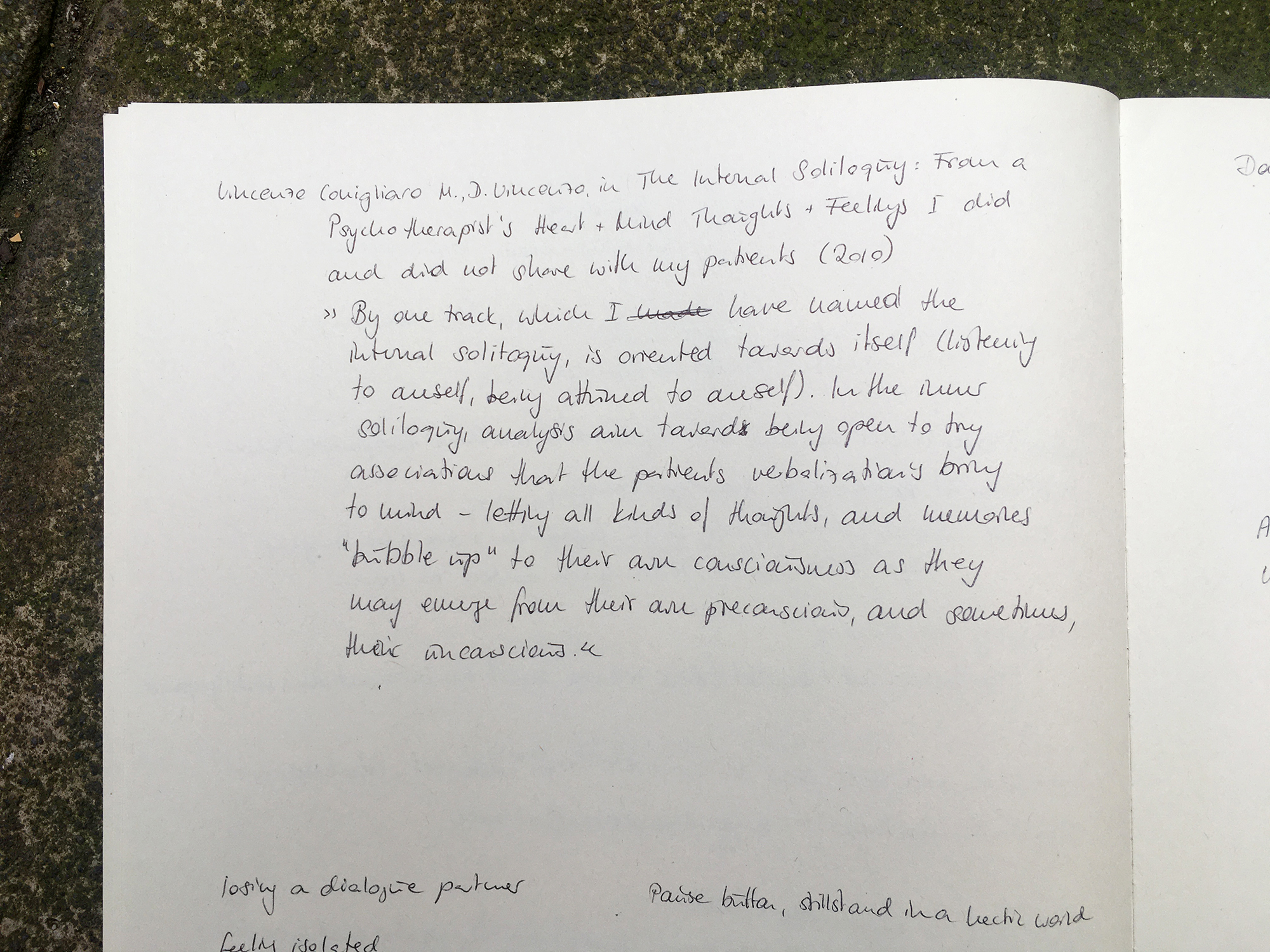
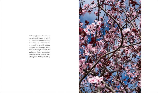
I didn't know the word Solioloquy. I actually first thought of the German word Selbstgespräch, searched for the translation and there was this new word. If I didn't know the word that does not mean no one else knows it. So, I did a little survey among my English speaking friends. Of 7 people only 2 knew the meaning but none of them were too sure if they were right.

On a side note: Kenneth Goldsmith published a book called Soliloquy in 2001.
»Soliloquy is a written record of every word (good, bad and indifferent), spoken by New York artist Kenneth Goldsmith during one week. The work originated as a gallery installation in 1997. As Gordon Tipper wrote in zingmagazine, “confronted with the clutter of ‘real’ speech … we realize that we all sound a bit like George Bush.”« (goodreads.com, 2020)
Artist's Statement

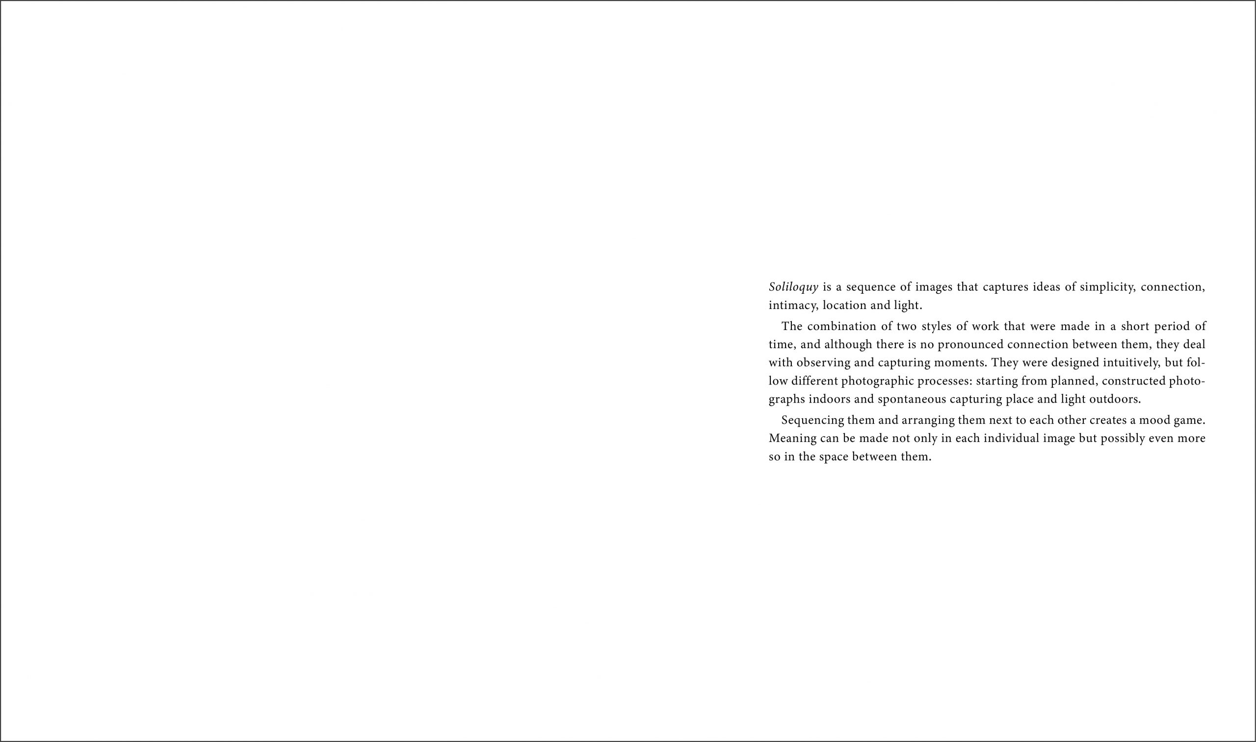
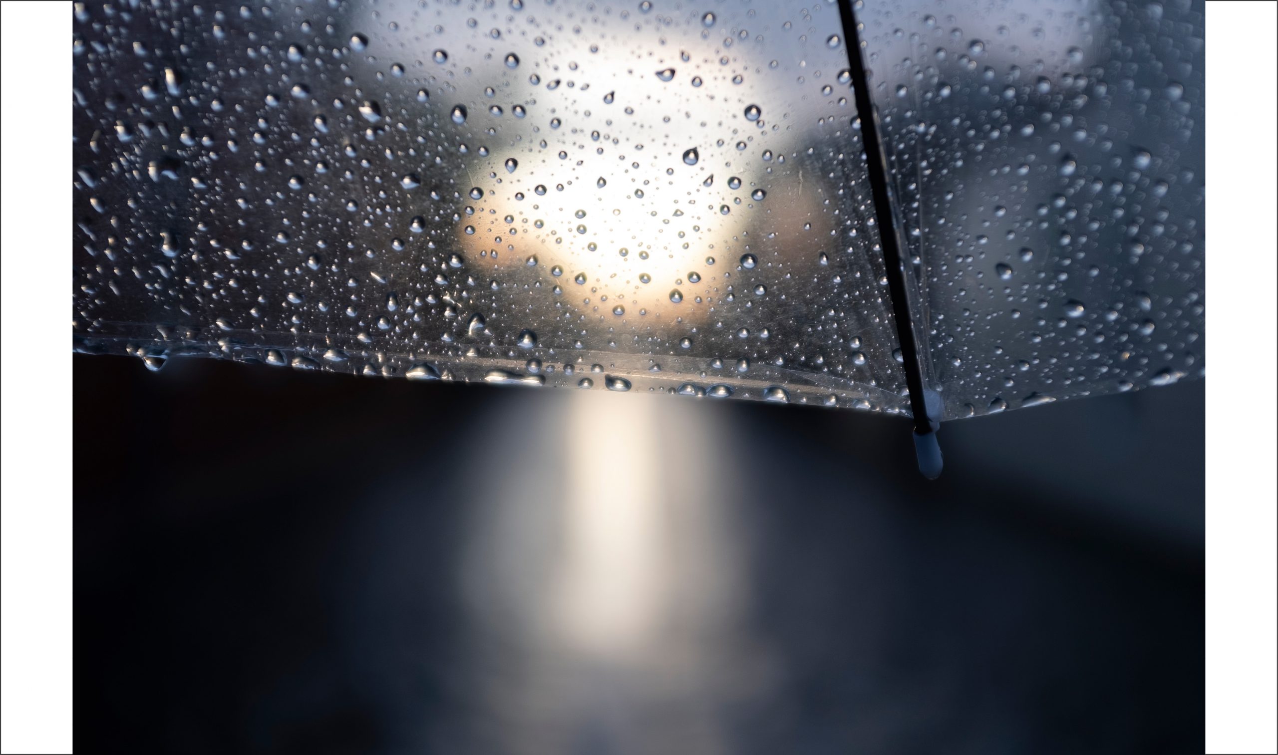
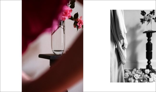
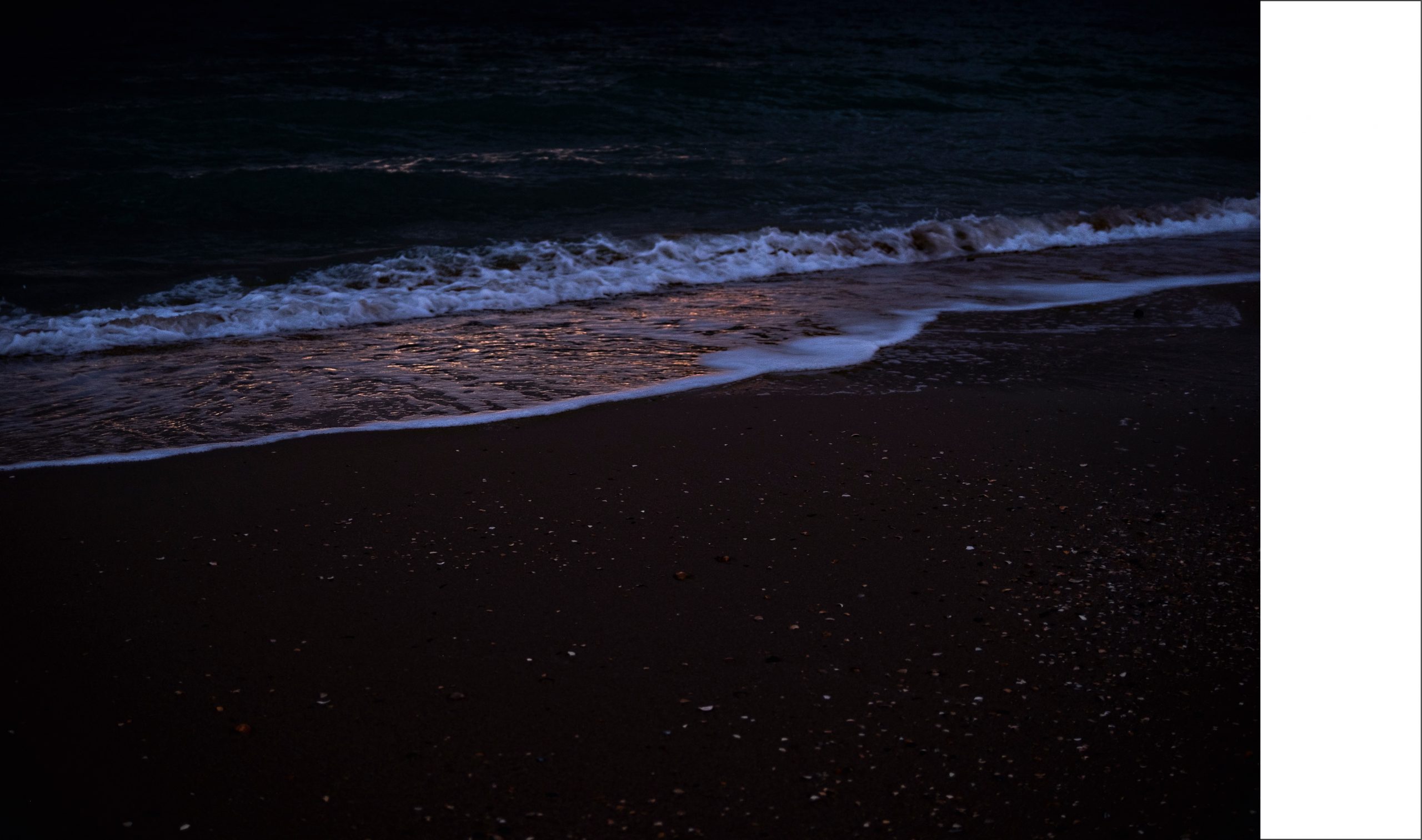
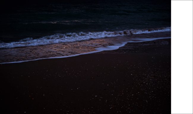
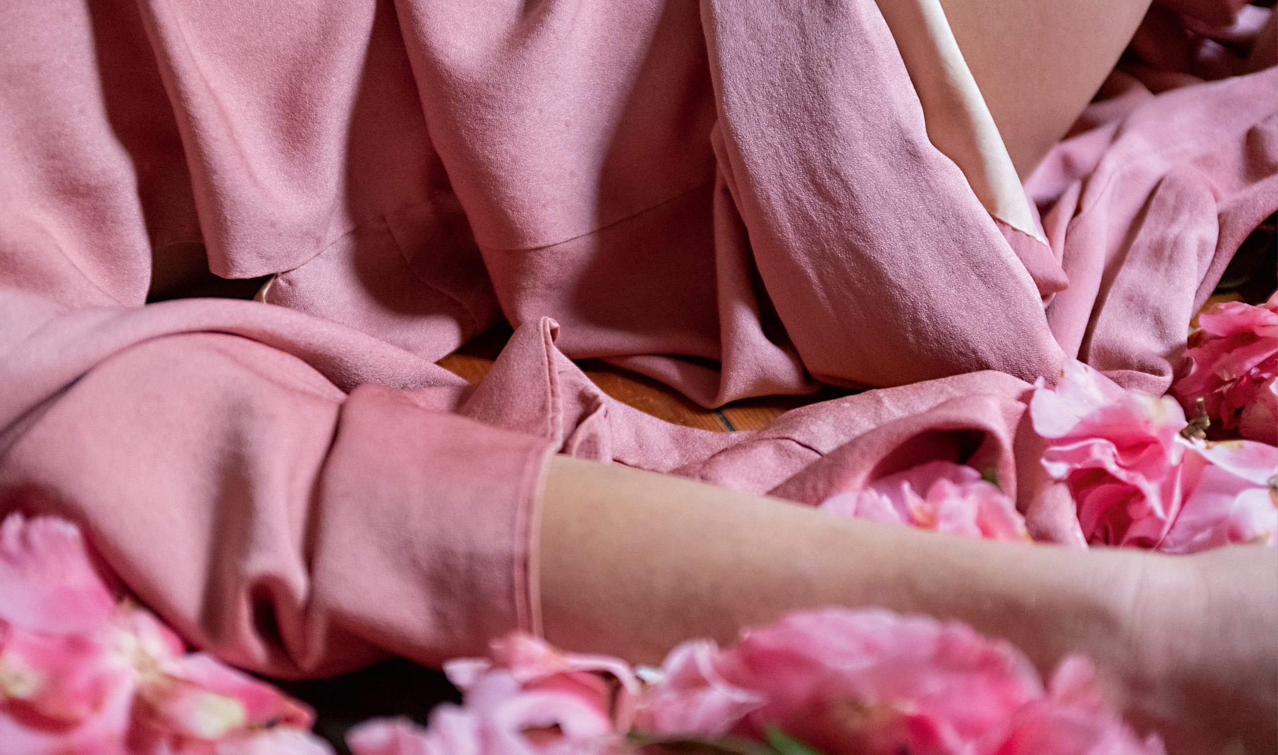
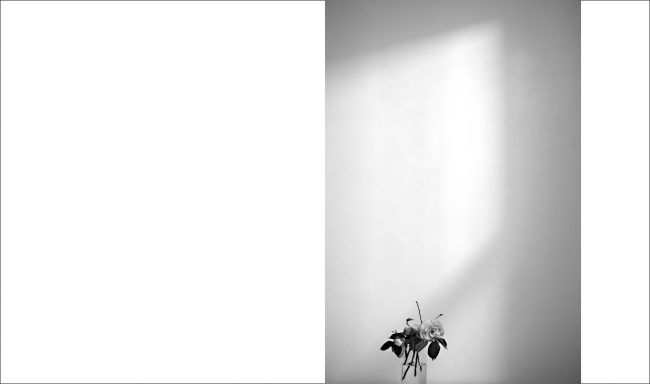
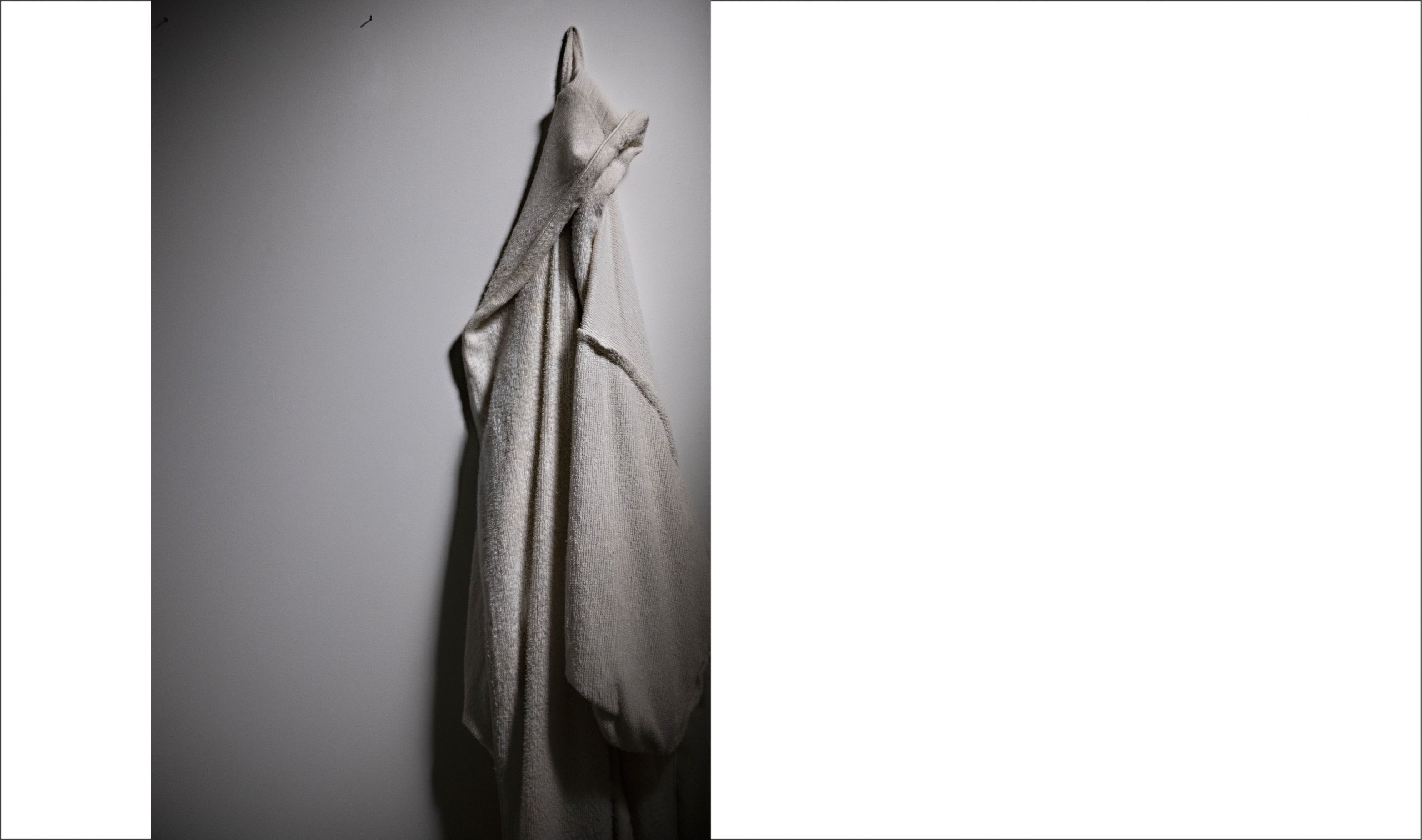
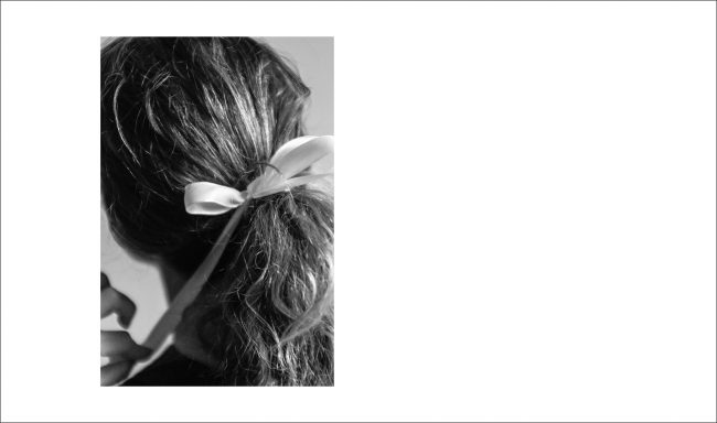
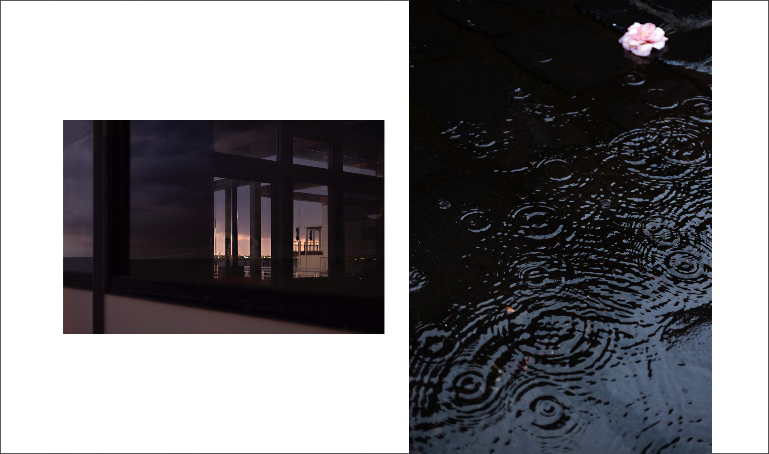
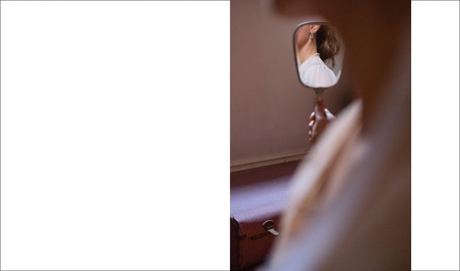
Soliloquy is a sequence of images that captures ideas of simplicity, connection, intimacy, location and light.
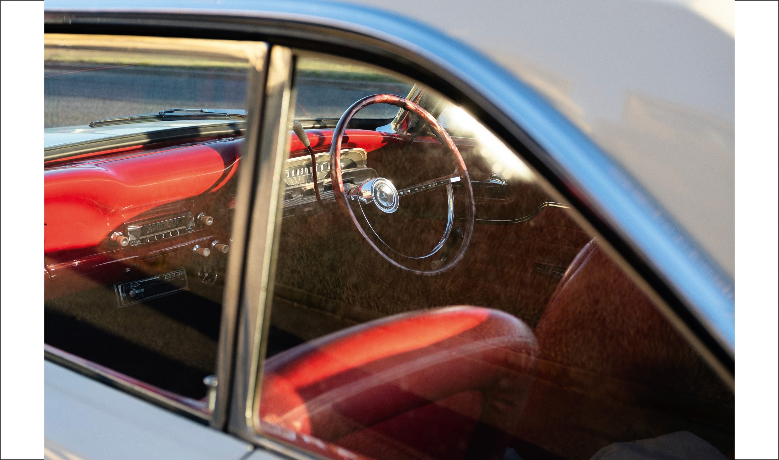
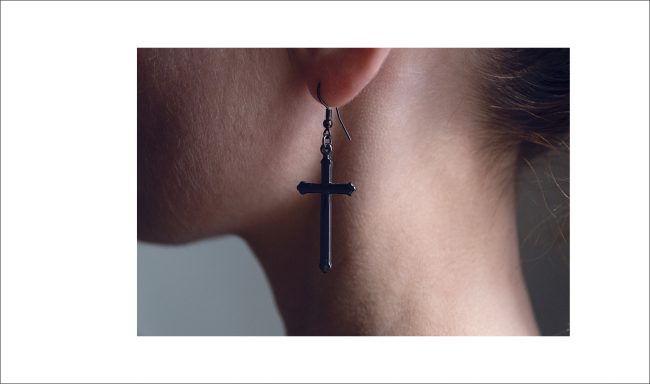
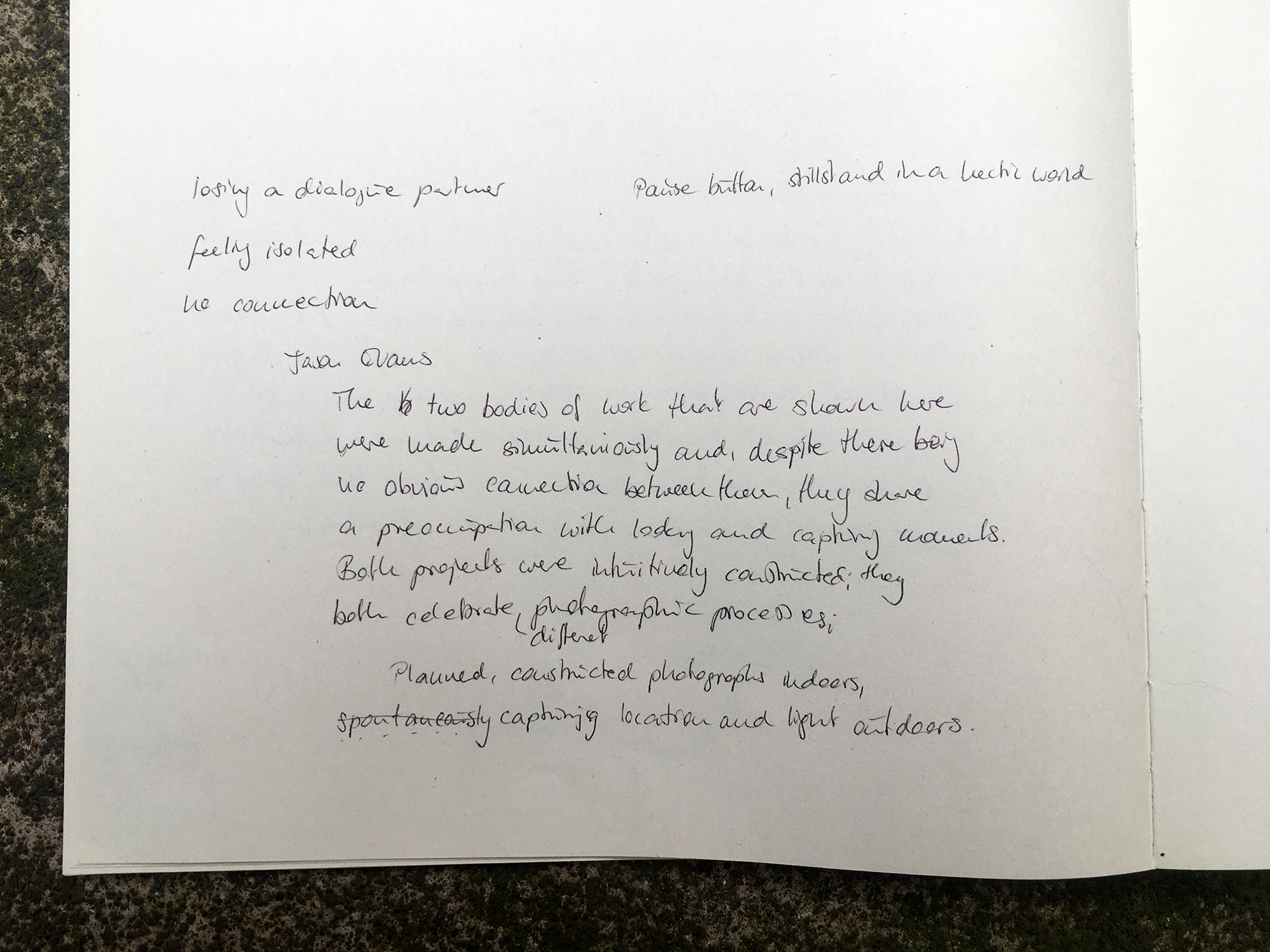
The combination of two styles of work that were made in a short period of time, and although there is no pronounced connection between them, they deal with observing and capturing moments. They were designed intuitively, but follow different photographic processes: starting from planned, constructed photographs indoors and spontaneous capturing place and light outdoors.
Sequencing them and arranging them next to each other creates a mood game. Meaning can be made not only in each individual image but possibly even more so in the space between them.
Final Presentation
I looked at blurb but I don’t like the aesthetics of their virtual book. As with most virtual appropriations (similar with Kunstmatrix), it rather shows the flaws of a book (effort to change pages) but misses all the good things (smell, sound, haptic, light and shadow, change of the viewpoint, the weight, texture of the paper etc). That’s why I prefer going with an website that lets easily imagine how a book could look like (but also works as a slide show on a website). Rather showing (and owning) what it is than pretending to be something it isn’t.
The website is a simple as possible. No overlaying navigation (clicking on the right half of the screen will take you to the next images – the left half vice versa), no overview, no exit.
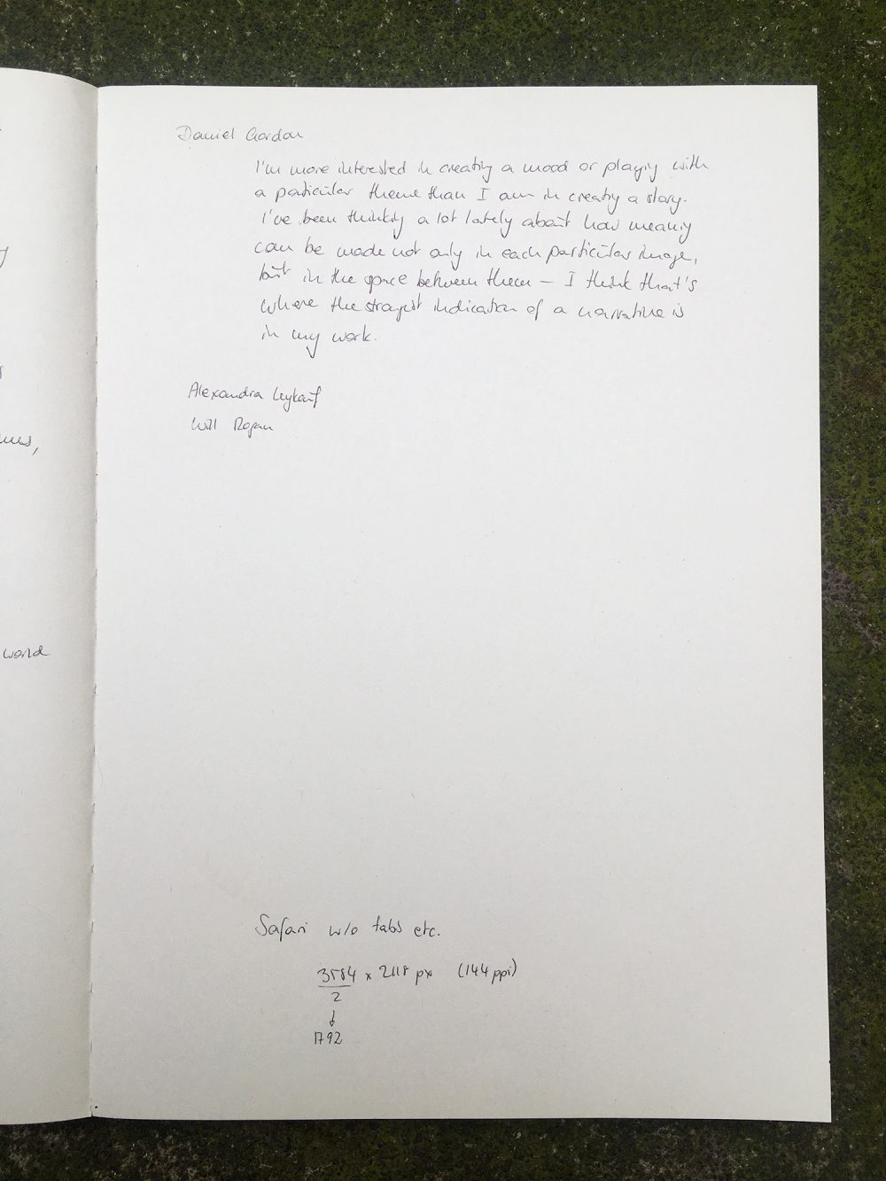
The layout is fitted to my browser window as this is how I will present the series (and there is no way to know how others will look at the images – screen, resolution, browser and if it’s full screen or not). Safari, no other open tabs and no bookmarks etc: 3584 x 2118 px (144 ppi). The main reason for this decision was, that I want this image to be as big as possible and only little to no white surroundings (the full pink experience).

S P E A K I N G C R I T I C A L L Y : non verbal presentation